Wednesday, December 16, 2009
Final Project: Music CD Cover

Thursday, October 22, 2009
TYPOGRAPHIC SELF-PORTRAIT.
Typographic Self-portrait.
Objective: The purpose of project is to create a self-portrait by using type as an illustrative and creative tool. Your objective is to create engaging composition that not only illustrates your physical attributes, but also provides a conceptual insight into you personal life. - - Think about one central theme that engages you the most at this point in your life. Enter a short blog entry summarizing your central theme. All of the generated copy from your blog entry will be used in creation of your composition.
Anger. Pain. Forgiveness. Those three words go hand in hand.My central theme is based upon those three strong words. What I want my theme to be based upon is the pain i have to go through because I’m adopted. I am very thankful that I was adopted, however there is pain that every child goes through when they are taken away and brought to another place. I want to portray that forgivness is something not easily done. And there is anger inside of me that I didn’t know I had because of the loss I went through. To me this is going to be something very powerful.
“Forgiveness is such a simple word, but so hard to do when you’ve been hurt”
-Kellie Pickler’s song ‘I Wonder’


Wednesday, October 21, 2009
Disliked Gifts: Design Principles
Assignment: Write in your blog a two sentence visual analysis of each composition – how you feel you achieved that visual principle by using the language of design.
First of all, I didn’t choose a “disliked gift” instead I chose a something that I did not like at all and what I had in mind was my roommate’s alarm clock. What I thought was more great about this alarm clock was that it was in a shape of a frog, so what ran through my head was that ‘great! It would make my piece more interesting!’
So the design principles that were chosen for this project were: contrast, repetition, alignment, and proximity. In an earlier blog I discussed and wrote what I thought what the definition of these principles were. The objective of this project was to chose your disliked gift or in my case something that you didn’t like and work with all of it’s different component parts and perspectives to create visually balanced and intriguing compositions.
Contrast. I guess when this one was finished it could have been perceived as repetition, but there was one key item that distinguished it to be contrast. The contrast between light v. dark. At first I wanted to have the contrast between color and black and white….what I found out was that it just didn’t turn out very well, and then I was stuck with the background (if I did the black and white and color). So light v. dark it was! I set the frogs at a slant because I already had frogs sitting straight up, I wanted something different. And then I started working on the transparency. It was fun working with it and what I learned was that the frog with the highest transparency would look like more it was black and white, most likely because the black in the background would reflect through of course.

Repetition. So for this one, I thought it would be the easiest. And well I guess you could say that, because I mostly pasted and copy, but aligning them up was quite some fun! So first of all I did not want to simply place the frog on one side and then repeat it throughout the whole square. So what I decided to do was take the frogs have seven them lined up and then have them have a reflection of themselves. So in this principle I also used the transparency on each of the frog.

Alignment. Oh how I loved alignment! This one I made my most difficult one for myself. Why you might ask? Well the reason why is because I decided to look at a different view of the frog, more specifically the top and the bottom view. This was hard of course because I got to use the friendly ‘ol pen tool! (I actually like it though!) However, it was challenging because I wanted to make as many lines as I could on the clock, so if someone just looked at that one piece out of all of them, they might guess what the object was! Alignment to me was how things are set up. So I wanted the top and bottom view close together, but then repeated (or some reason, I think repetition could be found in almost all of each principle). I wanted the two to be close to each other and then when they were repeated, I wanted two groups to be close together (grouped into one).

Proximity. This had to be the next to most difficult one. Proximity to me was how close things were to each other. So what I thought was having one big frog filled with a lot of little ones. At first what I thought was that I wasn’t going to change the transparency of the little frogs, however when I didn’t change it, it did not look very good, it just looked to crowded and even though they were all the same colors, it just looked like there was too many! So what I had decided to do was change it and it looked much better! Then aligning the little frogs inside the big frog was quite hard and just took a long time! I had to have them rotated the right way to make them fit! When I got closer to the middle, my intentions were to have the little frogs all the same size however that did not work. Because when I got to the middle it would not have fit, so I had to change the size so I could fit one more circle of them.

Those were the four design principles. That is how I used my disliked object to portray all of them.
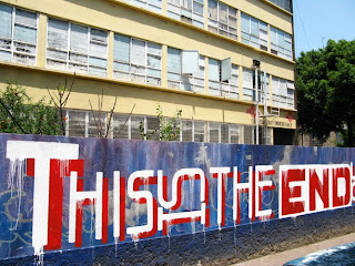
T
H
E
end.

Thursday, October 8, 2009
Responses to articles

Monday, October 5, 2009
The Four Basic Principles

The Four Basic Principles
Contrast
My definition of contrast is light v. dark or big .v. small. The way to reflect contrast the most is having two elements different. What I think that will make a stronger contrast is having a bigger difference between each element. I believe that contrast adds to a piece of work very positively, it gives it more shape, value and all the elements get added in.
Repetition
Repetition is having the elements repeat throughout the piece of work. Certain elements can be repeated for this principle to be shown in the piece. Things like line, shape, or fonts.
Alignment
I think the best description of alignment is when all the elements on the page are aligned then they are all connected together somehow. I think that should be a rule, all the elements should be aligned so there is more of a connection and unity between each element on the page.
Proximity
I think what proximity says that the objects or elements that somehow have a connection to each other need to be close together or in other words need to be grouped together. The objects that aren’t connected need to be not close together in proximity.